Research

Typography Research

Interesting animal illustrations/typography. The ‘Thank You’ poster was taken at London Zoo and has lovely clean animal graphics with subtle patterns using clipping masks.

IMG_20150627_121002929This display from the New Designers Graduate Show uses a flowing rhythm in its layout as your eyes move along the copy, which contrasts nicely with the breaks in the typography resulting in a very dynamic feel.

London Zoo Signs

ENCLOSURE SIGNS

Existing signs at ZSL London Zoo have bold modern graphics. Visuals and typography are equally strong as both are important for conveying information to the visitor. It needs to be eye grabbing and the information easily deciphered by the visitors, which means it must be legible and readable. The banner style is used a fair bit around the Zoo and I will try out this idea in my designs.

BLACKBURN PAVILION – DISPLAY GRAPHICS

Identification Signs

The current I.D. signs for the birdhouse have small size headings/subheadings and a very formal layout with the image on the left half, a description of the species on the right and top centred heading/subheading. This simple symmetry combined with the borders create an outdated look. These signs are positioned on the back wall of the walk-through where most visitors would miss them. My proposal is to redesign these signs with a fresher look.

Educational Signs

The educational signs focus on information about the golden age of ornithological study; the Victorian period with Charles Darwin and John Gould’s contributions being marked. The egg signs signs are fun and colourful with a modern look and do not need updating. A couple of the signs look a bit old fashioned, but the sign about John Gould appears up to date if a bit text heavy.

Victorian Inspired Design

Kristjana S Williams

The distinctive illustrations of Kristjana S Williams feature collages of animals that were inspired by Victorian engravings, and highlighted with vibrant splashes of colour.

New Designers Graduate Show

Attending the New Designers Graduate Show was a great inspiration with all the wonderful artists work and I found hand drawn design was quite popular.

Chocolate Bar Packaging

ANALYSING EXISTING PACKAGING

The main packaging design is heavily influenced by Kente Cloth, a type of fabric from Ghana, which reflects where the chocolate comes from and shows authenticity to the customer. The ribbon and seal style of the logo is a very classic traditional style with connotations of being long established and having the ‘seal of approval’, which gives the perception of a high quality product. The illustration on the label is of a cocoa bean and the leaves, which is classically drawn and has a Victorian engraving look to it similar to styles you sometimes see on expensive wine bottles, emphasising the idea of long established quality. The gold lettering on the logo strengthens this idea of quality and expense, while the limited colour palette of browns represents the ingredients of the product; coffee and chocolate. The typeface used is a serif font, which looks fairly traditional, again reinforcing connotations of quality. The Fairtrade logo lets the customer know that the product has been certified in accordance with Fairtrade Standards; it’s been ethically sources and the cocoa farmers are given a fair deal for their products. This heightens the value of the chocolate bar. When you open the wrapping the chocolate is covered in silver foil and I think it should have used gold foil to tie in with the expensive look of the design and to match the gold lettering. The ingredients label on the back of the product is mainly white and light blue, which looks quite generic and ‘own brand’ looking and cheapens the look of the product. This is a standard look across the whole chocolate range at M&S and I believe this is because it’s a requirement for labelling on all food/drink products to be ‘clear and easy to read’ and ‘easily visible’. The design suggests the target market of this product is an older, more sophisticated adult who is looking for a high quality product.

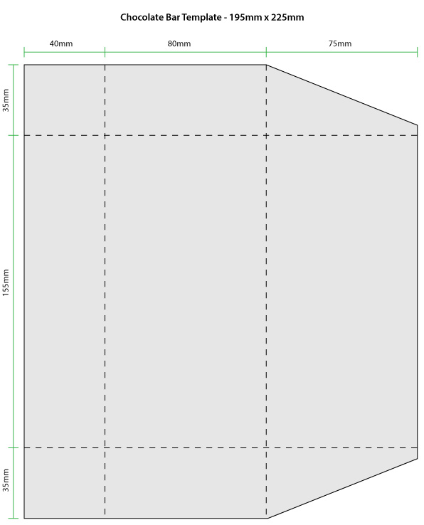
PACKAGING TEMPLATE

choc bar template-01I constructed this chocolate bar template based on some of the measurements of the M&S chocolate bar wrapper.

PACKAGING IDEAS

Photoshop – Photo Manipulation

One of the great misjudgements in art is the idea that “the camera never lies”: it does, a lot and frequently. Even before Adobe’s Photoshop was released – the ultimate image manipulator – back in 1990, there was no shortage of doctored images being produced, whether they were surreal, profound, or beautiful.

Source: http://www.dazeddigital.com/photography/article/20483/1/it-turns-out-photoshop-was-a-thing-even-in-the-19th-century

Correcting Photography

I corrected the under and over exposed photographs by adjusting the Levels and experimenting with Vibrance.

‘Perfect Imagery’

Using this image (taken by a photography student at WAES) I decided to manipulate it towards the more ‘ideal’ beauty in today’s world; that is a symmetrical face with big eyes, small nose and flawless skin.

I pulled the head upright so you could see the symmetry of the face and used the clone tool to get rid of the original position of the hair. I decided not to mirror the face to create perfect symmetry, I just manipulated parts to keep a more natural look. I used the Liquify filter to reconstruct the nose shape and to pull it further down the face to make it smaller and narrower. I also made the eyes slightly bigger with Liquify to keep in line with the ‘ideal beauty’ and pulled everything to the left to keep everything more symmetrical. I used the dodge tool to lighten up shadows under the eyes and used the healing brush tool to smooth out the neck join. I sorted out the levels to brighten up the skin and give her a glowing tan!

Removing Wrinkles

Fantasy Face

For the the fantasy face exercise, I wanted the architectural shapes to look as though they were part of the face. The colour blends in well with the skin tone, but I think I could have used Feather to soften up the edges. I created a symmetrical face for a more striking look, but used the Clone Tool to remove certain moles/freckles to avoid it looking obviously fake.

Joan Miró

I’ve been looking at the work of Joan Miró, specifically his more surreal/abstract paintings. He created surreal imagery with the use of repeated lines, shapes and patterns, which appear to depict abstract figures. Symbols of eyes come up a lot in his work, which give life to the paintings as we start to see faces within the random lines and shapes. He mainly uses a basic primary colour palette, which enhances the abstract quality of his work. I really like the paintings below; his abstract patterns are simple and complex at the same time, which is what makes his imagery so captivating for me. The brain tries to decipher and understand what is going in within the seemingly random shapes, but I find them more emotive than rational as the paintings appear to reflect a dream like scene or possibly the subconscious of Miró himself.

Photomontage

Photomontage is a process in which two or more photographs are put together to create a new image. In the past, methods such as cut and paste or multiple exposures were used to achieve this, whereas in today’s digital age Photoshop is the most widely used software for photo manipulation.


INSPIRATION

One of my favourite types of photomontage is the combination of different animals to create a new otherwordly creature. This is often brilliantly done and can result in beautifully surreal and striking images. On the other hand, I’ve come across some ridiculous looking creatures that while interesting in their own way are more amusing than true artistry.

Effective Photomontage

Source: http://www.funpic.hu/funblog/allatok/allatok.html

Less effective photomontage

Although using the same theme, I find the images below are less inspiring as there is not as much unity between the combined animals. We can clearly identify the separate parts of the animals used and in many images it just looks like a head has been crudely plonked on a different body. In the case of the shark/cat image, the large cute eyes combined with the sharp agressive teeth comes across as amusing rather than having a dramatic impact, although this is possbly what the creator was trying to achieve. In my opinion a striking animal photomontage comprises of subtle blending, a good balance of contrast between the animals used and seamless editing!

Sources: http://www.funpic.hu/funblog/allatok/allatok.html, http://www.pinterest.com


ARTIST’S WORK

Bing Wright – ‘Broken Mirror/Evening Sky’ photo series

Source: http://www.bingwright.com/

When I discovered these images during what turned out to be an extensive research session, I completely fell in love with them. The gorgeous, vibrant colours of the sunset combined with the strong black lines of the shattered mirror creates a stunning vision, which I find quite emotive. I could look at these a million times and not get bored.

We are presented with pictorial images, fragmented and in disrepair – a reminder that everything beautiful is flawed and imperfect.

Source: http://jamesharrisgallery.com/2013/05/bing-wright-3/

I like this idea of beauty in imperfection, or vice versa. I think as human beings, despite being imperfect in ourselves, the idea of perfection is a great desire. However, in truth it is an unattainable fantasy as nothing in life is perfect and I personally find comfort in the idea of beautiful imperfection.

I believe these images can be classed as photomontage due to the process in which they are made, detailed below:

Wright photographs sunsets, then projects the images onto mirrors he has broken in the studio. The mirrors are small, measuring just 14 x 11 inches. The artist re-photographs the reflection and then enlarges the image into a large scale format.

Source: http://jamesharrisgallery.com/2013/05/bing-wright-3/


Album Covers – The Good & The Bad

While looking at album art to inspire me in my own work, I came across some great and some very bad designs.


THE GOOD

(Annotations under images)


THE BAD