This is how my campaign developed from initial ideas to final solutions.
Advertising
Soup as Art – Final Campaign Ads
TUBE BILLBOARDS
BUS SHELTER ADVERTISEMENT
Overall, the final solutions for the Summer Greenhouse advertising campaign fit the brief well. The vibrant, eye catching ads show that the brand has a sense of humour and doesn’t take itself too seriously, which appeals to a younger audience.
However, I do feel that the USP of the product (homemade organic vegetables) is lost in the campaign as the focus is on promoting the brand’s ‘cool’ identity, rather than the organic element, and this would need to be considered when going forward with another campaign.
There are legal issues to consider for this campaign due to the use of artist’s work. With the Mona Lisa and American Gothic the copyright has ended because the creators died more than 70 years ago. This means the works should be in the public domain and can be used in the creation of new work. While the artworks themselves are in the public domain, the photographs of the paintings can be copyrighted. However, I made sure the image was taken from Wikimedia Commons, a database of freely usable media files. Therefore to go forward with this campaign, it would be necessary to replace Magritte’s The Son of Man with another painting that can be found in the Public domain.
Advertising Campaign Brief
Ad Campaign – Final Artwork Manipulation
Working in Photoshop for the final artwork, I included a spoon to further contextualise the imagery in the campaign. Trying to blend the product into the paintings was my biggest challenge as my packaging is very ‘digital’ looking due to it being created in Illustrator, whereas the artwork is very textured as it was hand painted. I added a vast number of blends, pattern overlays, textures, shading and adjustment layers on the soup layer in order to simulate the look of it being painted into the image. For the Mona Lisa, an orange-yellow colour on the hue/saturation adjustment layer was effective at bringing the whole image together.
Ad Campaign Development – Manipulating artwork
When researching I found that manipulating famous artwork and creating spoofs of iconic imagery for comedic effect is very popular.
Desperate Housewives – Opening Sequence
The opening sequence is filled with famous art references that have been manipulated to represent the characters in the show, resulting in an amusing intro to the programme.
- “Adam and Eve” – Lucas Cranach the Elder
- The Tomb Paintings of Queen Nefertari
- “The Arnolfini Portrait” – Jan Van Eyck
- “American Gothic” – Grant Wood
- “Pin Up Girl” – Gil Elvgren
- “Am I Proud!” – Dick Williams
- “Campbell’s Soup Cans” – Andy Warhol
- “Romantic Couple” & “Couple Arguing” – Robert Dale (Pop-Art)
Initial Ideas
Realised I needed to use famous paintings that featured people to create context in the image. It means the product can interact with the subject of the painting.
‘LadyKiller’ Adverts
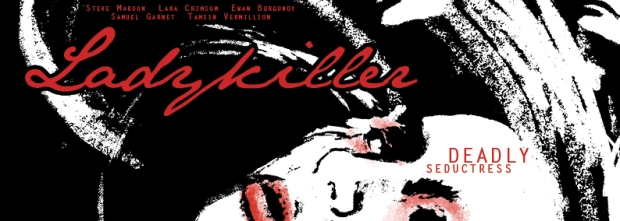
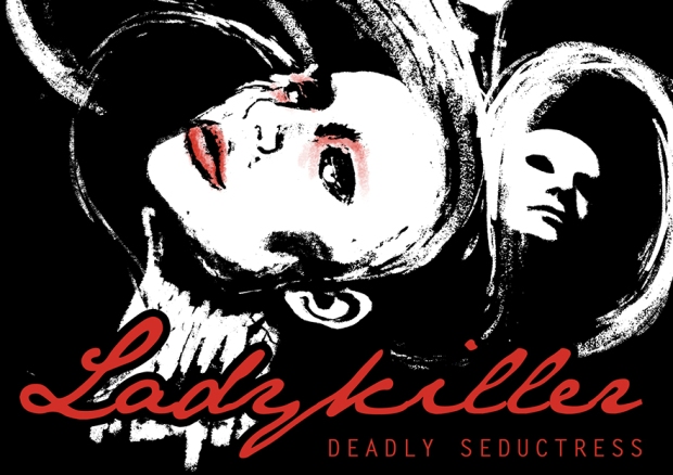
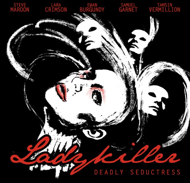
After creating the ‘Ladykiller’ film poster, we were given specific sizes from the client to fit the design into different newspaper adverts.
 DAILY MAIL AD
DPS Low Banner (Half) Right Page (Recto)
W 280mm x H 100.2mm
THE GUARDIAN AD
220mm Deep x 10 Column Fireplace
W 311mm x H 220mm
‘Ladykiller’ Film Poster
Campbell’s Soup Adverts – Research
The history of Campbell’s Soup spans about 150 years and throughout has usually stuck to the theme of traditional American values; cooking for the the family, wholesome food and American football. The branding and ad designs have evolved over time with the development of graphic design and various technologies, but the core message of the campaigns has stayed fairly consistent. Some themes have included ‘the goodness of vegetables’, ‘kids are cute and need soup’, ‘create new meals with Campbell’s soup’, American football association, Hollywood Star endorsement and ‘real men eat Campbell’s soup’.
Looking at Campbell’s soup campaigns, there is a strong connection with family life, which is embedded in the brand after so many years of promoting this angle. However, I don’t think this traditional concept would work for a new brand such as Summer Greenhouse and a more modern idea needs to be explored.
Some of the more modern ads have deviated from the tradition approach, for example, using Campbell’s soup to create cocktails, featuring bronzed leggy models to sell soup during the summer and highlighting the low calorie value to sell Campbell’s soup as ‘diet’ food. These concepts are more contemporary and fit better with the varied lifestyles and ideals of today’s society. Despite this, traditional concepts are still received well in ads today.
Ad Campaign Ideas – Soup as Art
The idea came about to physically place the Summer Greenhouse soup into famous works of art. I also tested out some wording to go with the imagery, relating the product to the famous artwork.
Art Gallery Style
 Idea for showing soup as works of art in themselves. Used gold vintage frames for authentic museum look, combined with bold colours to modernise the overall look and create a vibrant advert. The colour in the background was picked out using the colour picker to tie in with the vegetable flavouring of the soup.
An Andy Warhol influenced design, referencing the Campbell’s soup can screen prints that he famously created. Unfortunately the art reference may not be obvious to the viewer without somehow mentioning Warhol himself in the ad. However, this would likely bring up legal issues, moving from being ‘inspired by’ Warhol to copyright infringement. The vibrant colours attract attention even if the art reference does get lost.
Ad Campaigns – Research
Researching advertising for food products to inspire my designs.
Proper Corn, vibrant colours distinct to each flavour. Simple appealing design. Symmetrical layout split into 3. Popcorn to make up pattern. Product placement in centre.
Influenced my design. Simple cute graphics, vibrant colours. Product packshot. Product makes up illustration.
Green & Black’s Organic Chocolate. Vibrant colour – corresponding with flavour, same as Proper Corn ad. hand drawn ink illustration + photography, vignette. Key words ‘Crunch Time’, ‘Cherry Picked’.


