

Vanishing point/bevels/3D cap in illustrator

Summer Greenhouse Homemade Organic Soup – Sun Dried Tomato & Basil

Summer Greenhouse Homemade Organic Soup – Roasted Carrot, Parsnip & Coriander

Summer Greenhouse Homemade Organic Soup – Chargrilled Aubergine & Mushrooms
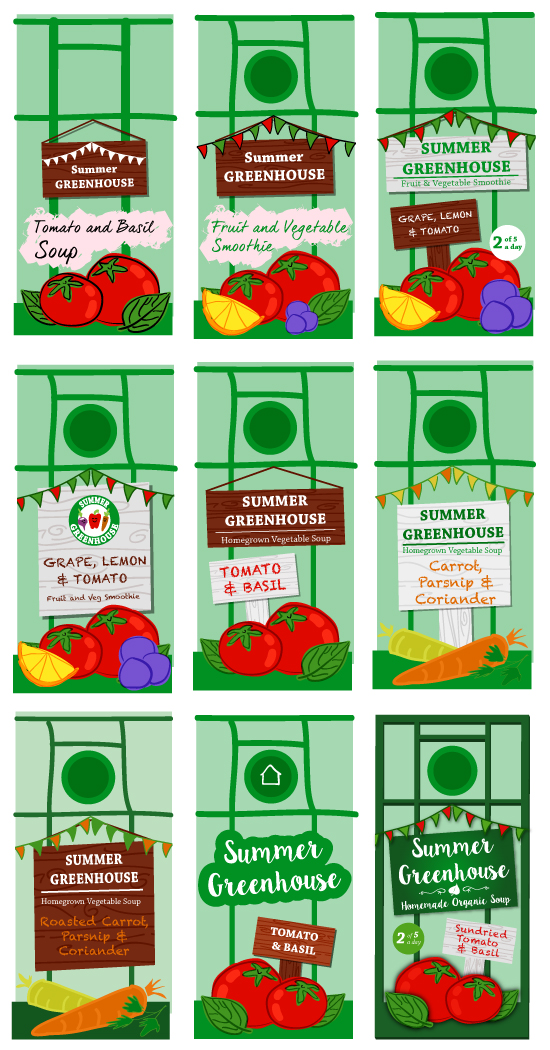
LAYOUT IDEA

FRONT OF PACKAGING
DESIGN ELEMENTS
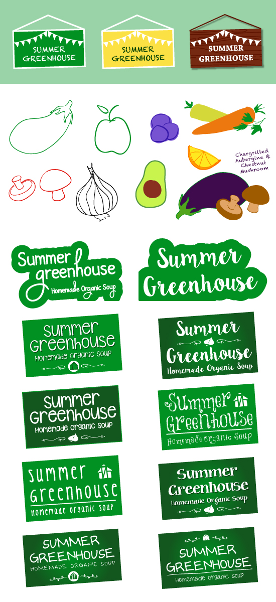
LOGO
![]()
Existing Packaging Template


I bought this product to help me construct my template using these dimensions as a rough guide.
FINAL TEMPLATE
 My final soup packaging template to fit on A4.
Logo + Design Ideas
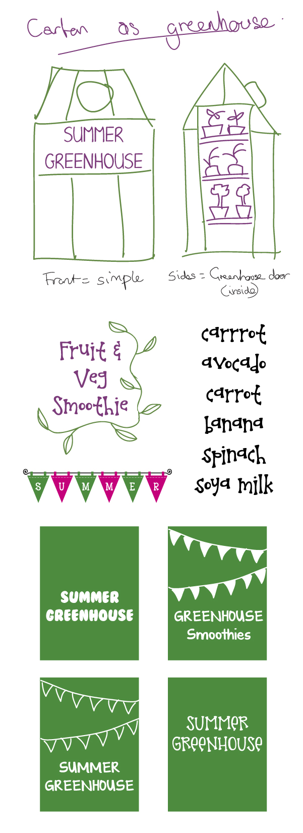
Starting to play with ideas for different design elements of the packaging including brightly coloured geometric shapes for a modern look, simple structured logo design and hand-drawn style logo design. The ‘organic, home-grown’ concept and greenhouse design idea is something I’m going ahead with, along with the brand name ‘Summer Greenhouse’.
Logo Ideas
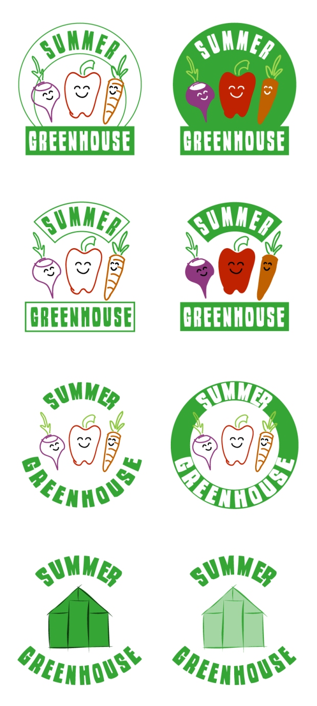
Here are some of my logo designs, trying to balance the traditional and the modern. This typeface is called ‘Woodstamp’ and the letters have a carved effect, possibly a bit too old fashioned for my design. The cute fruit/veg character designs are nice, but I’m going to develop the greenhouse logo designs.
Font/Design Ideas
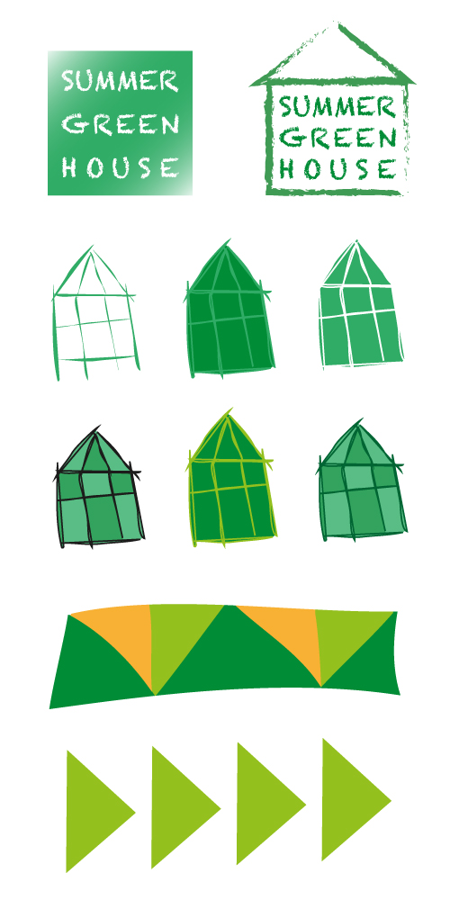
While looking at existing soup and smoothie packaging I was suddenly struck with the shape of the carton and gave me the idea of designing the packaging as a greenhouse itself. It could work as the top slopes like a roof. I tried out different design elements and fonts with a fun quirky vibe to them to keep a modern feel to the branding.
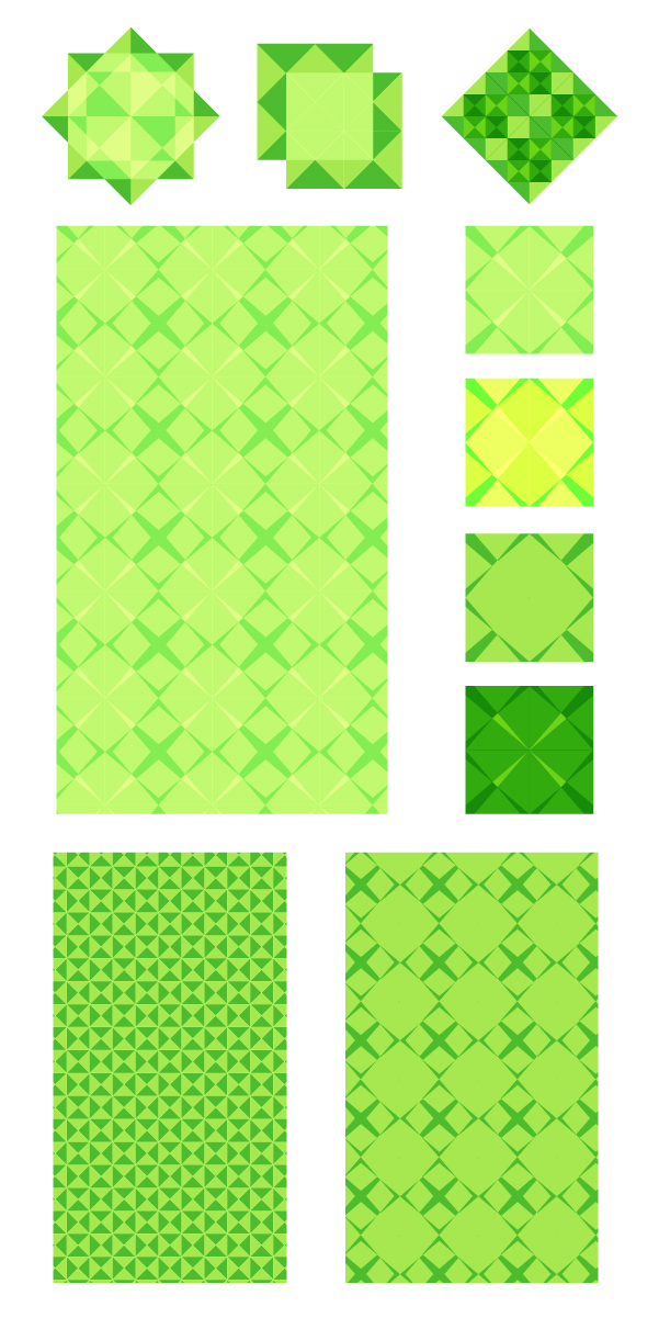
Pattern Design Ideas
Some ideas for using patterns as the main part of the design this can create great effects and a simple modern look. The green reflects the fresh, organic quality of the produce.


I decided I wanted to do something a bit different for my product, something healthy rather than chocolate bars or drink cans. I’m a big fan of smoothies so I started with that and I thought about doing a veg and fruit smoothie, which I haven’t seen in supermarkets. Scribbling down some sketches and ideas in a notebook, I feel I’m settled on the idea of using a greenhouse in my design and the concept of creating a ‘healthy organic homemade’ product. I realised I was coming up with quite traditional ‘homely’ designs from this idea of organic vegetables and fruit. However, I want to try and balance a traditional look with a modern fresh design.
USING PHOTOGRAPHY


After experimenting in PhotoShop, I realised using photos of the fruit/vegetables in a drink has been done many times before and it may be difficult to produce something different that will stand out. An illustrated packaging design might work better to create something eye-catching with a fun modern look.


 .
.
Chocolate Text


ANALYSING EXISTING PACKAGING


The main packaging design is heavily influenced by Kente Cloth, a type of fabric from Ghana, which reflects where the chocolate comes from and shows authenticity to the customer. The ribbon and seal style of the logo is a very classic traditional style with connotations of being long established and having the ‘seal of approval’, which gives the perception of a high quality product. The illustration on the label is of a cocoa bean and the leaves, which is classically drawn and has a Victorian engraving look to it similar to styles you sometimes see on expensive wine bottles, emphasising the idea of long established quality. The gold lettering on the logo strengthens this idea of quality and expense, while the limited colour palette of browns represents the ingredients of the product; coffee and chocolate. The typeface used is a serif font, which looks fairly traditional, again reinforcing connotations of quality. The Fairtrade logo lets the customer know that the product has been certified in accordance with Fairtrade Standards; it’s been ethically sources and the cocoa farmers are given a fair deal for their products. This heightens the value of the chocolate bar. When you open the wrapping the chocolate is covered in silver foil and I think it should have used gold foil to tie in with the expensive look of the design and to match the gold lettering. The ingredients label on the back of the product is mainly white and light blue, which looks quite generic and ‘own brand’ looking and cheapens the look of the product. This is a standard look across the whole chocolate range at M&S and I believe this is because it’s a requirement for labelling on all food/drink products to be ‘clear and easy to read’ and ‘easily visible’. The design suggests the target market of this product is an older, more sophisticated adult who is looking for a high quality product.
PACKAGING TEMPLATE
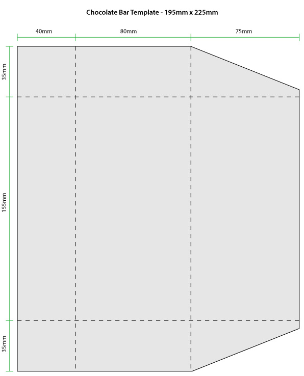 I constructed this chocolate bar template based on some of the measurements of the M&S chocolate bar wrapper.
PACKAGING IDEAS


